Friday, 8 March 2019

Wednesday, 6 March 2019
Audience and feedback- 06/03/2019
Task 1- define
your audience using the following AUDIENCE SEGMENTATION model (20
minutes)
Socio economic: GEARS
- Gender
- Ethnicity
- Age
- Region 9 regional identity
- Socio-economic
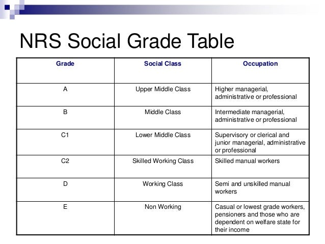
For each part of the acronym state what will be in the advert (in terms of media language/representation) to attract your audience, use the brief to help establish the target audience profile.
Gender
The genders are targetted both females and males.
Ethnicity
All ethnicities are targetted including both white and black. For example i have 2 different models from different ethnicities- a white and a black boy.
Age
The age targetted for the adverts is 16-21 as shown in my advert where the model is a 16 year old female.
Region 9 regional identity
The region that the advert is symbolising is the Essex region as there is Essex stereotypes displayed through the advert for example the girl is wearing a red lipstick which is a common stereotype used to describe the girls from Essex.
Socio-economic
As the advert is for ``Just Eat`` therefore the socio-economic classes targetted are mainly the middle class or lower middle class. Therefore in order to portray that this is the class targetted this will be shown through the way the model is dressing- the type of clothes they are wearing.
Task 2

The Aspirer & The Succeeder
My advert will be targetted to attract The Succeeders and The Explorers. In order to attract them my model will be from a middle class and will be wearing new branded clothes showing they are always looking at the new stuff that has just came out. The Aspirer will be attracted as they are materialistic people who mainly judge based on the appereance and image of the persona.
Task 3- survey on the adverts
Survey- MonkeySurvey
Question 1: What`s your age?
- 16 or younger
- 16-21
- 21-25
- 25 or older
Question 2: What`s your gender
- female
- male
- other- please specify below
gender:
Question 3: If you can change something what would it be?
- the location of the advert
- the font
- the logo
- the slogan
- the colours of the advert
- the appearance of the model in the advert
- something else- please specify what
something else:
Question 4: Knowing that the target audience is 16- 25 year olds how successfully do you think the advert represents/portrays that?
- very successfully
- fairly successfully
- not very successfully
- not successfully at all
Question 5: Depending on your answer in q4 please state why you think that
-
Question 6: In your own words, state one thing you really like about the advert which makes it effective.
1.
Question 7: In your own words, state 2 things you do not like as much about the advert and would like to change in order to make it more effective.
1.
2.
Question 8: According to you and your personal taste, what advert of the following appeals to you the most (judging on the font, location, slogan, how successfully it relates to the essex culture and its stereotypes, the target audience, and socio economic- the social class represented)
- Advert 1
- Advert 2
Question 9: How likely are you to order something from `Your Food` services after having a look at the potential adverts?
- very likely
- fairly likely
- not very likely
- not likely at all
Question 10: How successfully do you think the adverts represent the Essex culture and the stereotypes held upon the Essex region.
very successfully
fairly successfully/ to some extent
not very successfully
not successfully at all
very successfully
fairly successfully/ to some extent
not very successfully
not successfully at all
Question 11: Depending on your answer for Question 9, what things from the adverts made you make this decision?
-
-
Friday, 15 February 2019
Advertising research- 15/02/2019
Advertising Research
Example of images that can be adopted and used in my advert for food take away.






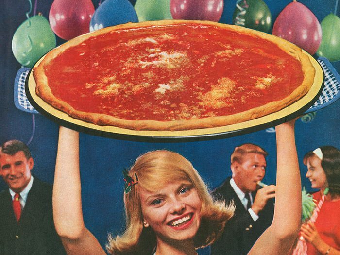
Strapline- a subsidiary heading or caption in a newspaper or magazine
Tagline- a catchphrase or slogan, especially as used in advertising, or a punchline of a joke
Slogan- a short and striking or memorable phrase used in advertising.
Potential/ example slogans/taglines
- The taste of joy
- Full of goodness, full of value
- What you want, is what you will get
- Have a taste of goodness
- Do you believe in magic
- Unbelievable... but true
- Your food, your best choice
- Your food... best food/ your food, best food
- Chose Your Food, make your dreams come true
Related to Essex culture/ stereotypes
- At the end of the day, we all chose Your Food ( Essex related)
- Shut up, eat Your Food (Essex related)
- Get messy, get Your Food
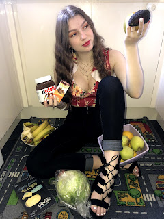
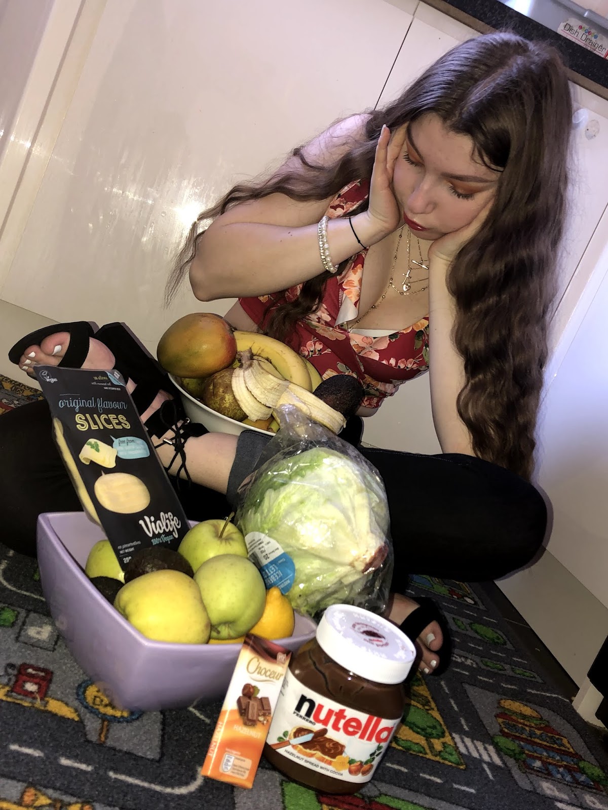
Possible shooting locations
- inside locations eg: in a kitchen
- inside a restaurant, food place in general
Shoot Locations


Statement of intent
Example of images that can be adopted and used in my advert for food take away.

Strapline- a subsidiary heading or caption in a newspaper or magazine
Tagline- a catchphrase or slogan, especially as used in advertising, or a punchline of a joke
Slogan- a short and striking or memorable phrase used in advertising.
Potential/ example slogans/taglines
- The taste of joy
- Full of goodness, full of value
- What you want, is what you will get
- Have a taste of goodness
- Do you believe in magic
- Unbelievable... but true
- Your food, your best choice
- Your food... best food/ your food, best food
- Chose Your Food, make your dreams come true
Related to Essex culture/ stereotypes
- At the end of the day, we all chose Your Food ( Essex related)
- Shut up, eat Your Food (Essex related)
- Get messy, get Your Food
Possible shooting locations
- inside locations eg: in a kitchen
- inside a restaurant, food place in general
Shoot Locations




Statement of intent
- 350 words
- write how the advert links to LIAR
For advert & to write about
- Font
- colour
- masthead
- header
- typography ( the font and shrift) ( serif/ sans serif and why it is used)
- mode of address
- logo
- font
- mise en scene
- same strapline
LYNX advert
- purple tones royal colour, shows power and importance
- angel links to religion
- white links to purity, innocence and cleanliness linking it back to the fact that they are advertising a spray, deodrant
- Get girls if you wear it
- ``even angels will fall`` implies that even girls/angels have sides, and this angel must have done something bad have fallen from heaven to earth
- there is always a bad side to a girl
- the white is not pure white but a dull and dirty white symbolising the rebellion
- there is a women used in this advert in order to seduce men as the target market of this product is males.
- as long as you just use/ wear this spray this will lead to even the angels coming down to earth for you because of the smell of the deodrant
- feminism- Van Zoonen
- stereotype- women being objectified
Slogan to be the same
Strapline to be different
Friday, 8 February 2019
Logos- 8/02/2019
Examples of logos



Logos must:
-relate to essex culture
- be simple
- youth culture
- target audience is youth culture/ young people
ages 15-25
- humour
Example logos
The potential logos must most importantly relate to the essex culture and portray a few stereotypes through them.
Appeal
- humour appeal
- youth appeal
- endorsement appeal
- popularity appeal
- social appeal
- intertextual links to include
Explain the reasons why the following appeals are being used.
- Gender hybridity
Firstly, i have chosen the red lips to be the logo and the main focus as it very clearly represents the femininity of Essex girls. It also portrays a stereotype which is held for the typical Essex girls, that they are always made up almost being entirely fake and never natural illustrated by the hard red lipstick on the lips. Also, another stereotype displaye by the red lipstick is that they are provokative girls always in the search of men, rather than focusing on their own well-being and future persepctive or goals.
Secondly, the main reason for me to choose the red colour for the lipstick and the lips is that it mainly symbolises a warning or a danger approaching, which therefore focuses the attention of the audience onto the logo and therefore on the potential advert. Also, the people who desire this colour are aggressive or energetic therefore this this makes a link to the Essex culture of the males as they are stereotyped as being aggressive and rude into violence. However, the colour moreover represents the strive for success which is a perfect match and combination for the logo of the advert as it's ruling and crucial purpose is to be succesfull so a higher number of people can order from ''Your Food''. It represents the determination and action being taken in order to become affluent.
On the other hand, the main colour of the logo which is the red, is contrasted with the black colour which is used in the wirting ''Your Food''. As the red is a powerful colour it is combined with the black in order for it to stand out in this visual environment. The combination of the 2 colours is very effective as they both support eachother as a result of their similar connotations, both emphasising importance and sophistications. However, they are also two very contrasting colour as the red is a very highly saturated and bright colour whereas the black is a very dark, dull and unsaturated colour, which therefore increases the interest of the audience. A well as, the warm colour red transmits a cheerful, positive and optimistic tone towards the people looking at the advert. And in addition to this, the black colour used in the text writing depicts the formality, seriousness and therefore represents the advert as very original.
Wednesday, 6 February 2019
Analysis of Adverts- 06/02/2019
Requirements of the brief
•You work
for an in-house print production company within an advertising agency. You have
been given the task of producing a campaign of four full-page magazine adverts to
promote a new takeaway food delivery service.
•Summary
of brief requirements:
–Statement
of Intent (approx.
350 words).
350 words).
–Magazine
adverts:
The
client has insisted that each advert must have a different main image, with at least
two different
settings and at least two different models used across the four adverts.
–Location
of adverts: The
adverts are to be placed in regional magazines and
the content should reflect the location.
–Client
target audience: 16–25,
mass market, male and female demographic in a defined geographical region.
•This new
takeaway food delivery service – YourFood
–
wants to be defined by its regional and youthful brand identity4.
•All
four adverts must contribute to a strong and consistent brand identity, using
the same slogan/tagline.
•The
adverts should use techniques – such as intertextuality,
generic hybridity, humour or
emotional appeal – that engage the target audience and make the adverts
memorable.
•Your
finished realisations of
the four adverts must be presented as A4 prints, with
the image scaled down as necessary to preserve the correct magazine page ratio.
the image scaled down as necessary to preserve the correct magazine page ratio.
•Your
magazine adverts must adhere to the rules of the Advertising Standards
Authority (ASA): https://www.asa.org.uk/
- 4 different locations
- shops/ fast food places
Eye contact is made by the chef looking directly at you
The red background colour symbolises the importance and significance of the advert. It can also imply a warning as the red is an alarming colour.
Anchorage portrayed through the chef pointing his finger at the phone
The headline is in capitals which is eye catching and puts the attention of the people on the advert.
The finger pointing creates humour.
Saturated colours are quite positive.
Complimentary colour of the red and white make the white captions stand out.
Colour theory
The caption ''don't cook'' is quite playful and humorous therefore it presents the idea that if people can't cook or do not have time to cook/clean up the mess, just eat will take care of that and solve these problems.
The direct mode of address is effective as it creates a relationship between the on viewer and the advert. This creates a playful and humorous tone. There is informality as the chef is smiling and he's not serious, which would make the viewer feel more comfortable- more likely to order from just eat.
Serif is used to make a link to the modern society we re in. the advert is not out-dated or old, is in fact modern.
Intertextual links:
- stereotypical italian chef- moustache
- super mario
- 118 advert
Colours are very saturated conveying the positivity.
The colours used in this advert are mostly associated with femininity which can create a conflict.
The yellow colour is a compelling and youthful colour which can be linked to the younger generations and make the adverts more suitable for a younger audience/target market.
The yellow colour is also the colour of success which can directly link to the idea that these adverts are very popular and successful therefore attracting the audience.
The colours used are analogous colours:
-orange
-yellow
Most colours such as the yellow, orange and pink are warm colours.
There is a connection in the third side between the 2 different shades of green and the caption ''to the park'' so the caption is explained through the colours used. The green is associated with healthy food.
There are 3 different age groups presented presenting the idea that the advert is directly aimed at a specific age group.
The expressions of the people are positive as we can se that they are all smiling which can imply that all clients and people are satisfied and happy with the delivery service offered by ''deliveroo''.
stroke- outlining
Logos
bright and saturated colours
- art work/ to be simple
- fonts- bold
- relevance
- memorable
stroke- outlining
Logos
bright and saturated colours
- art work/ to be simple
- fonts- bold
- relevance
- memorable
Textual analysis print adverts- 6/02/2019
Advertising strategies
- celebrity endorsement
- saturated/bright colours
- font big and bold
- promotions/ student discounts
- eye catching, memorable headline
- alliterations
- double ontondra
- serif/sans serif font
- serif font is more modern
- incentives
- intertextual links
- humour
- images/illustrations
- hashtags/trends on social media
- exaggerate stereotypes
- slang
- vernacular
- 'init,you know what i mean, peng'
Subscribe to:
Posts (Atom)